# All functions to manipulate data
import pandas as pd
# Seaborn Object Interface
import seaborn.objects as so
# and other Seaborn functions
import seaborn as sns
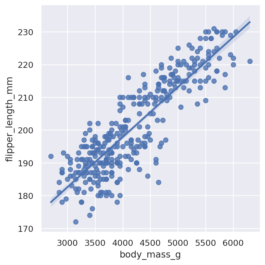
# The palmer penguins dataset;
# that we are going to use for practice
from palmerpenguins import load_penguins
penguins = load_penguins()
# The diamonds dataset
from seaborn import load_dataset
diamonds = load_dataset('diamonds')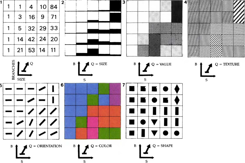
AUTHOR: Jacques Bertin
YEAR: 1967
BOOK: The Semiology of Graphics
Examples of planar and retinal variables.
Planar Variables
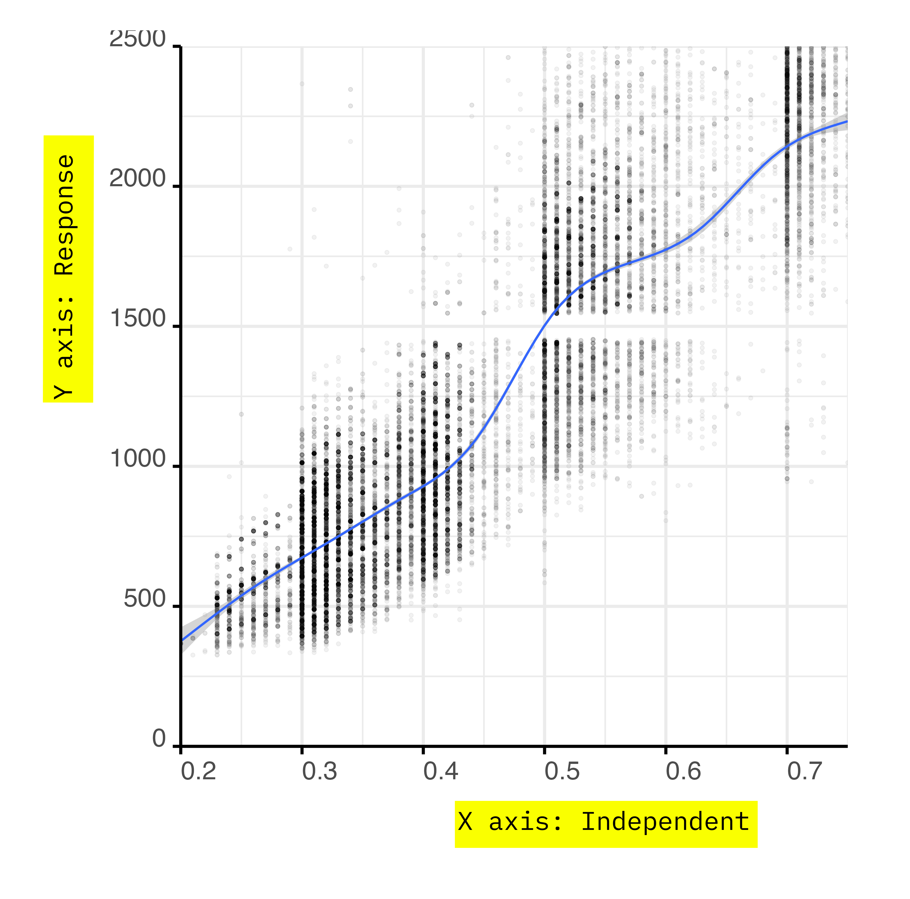
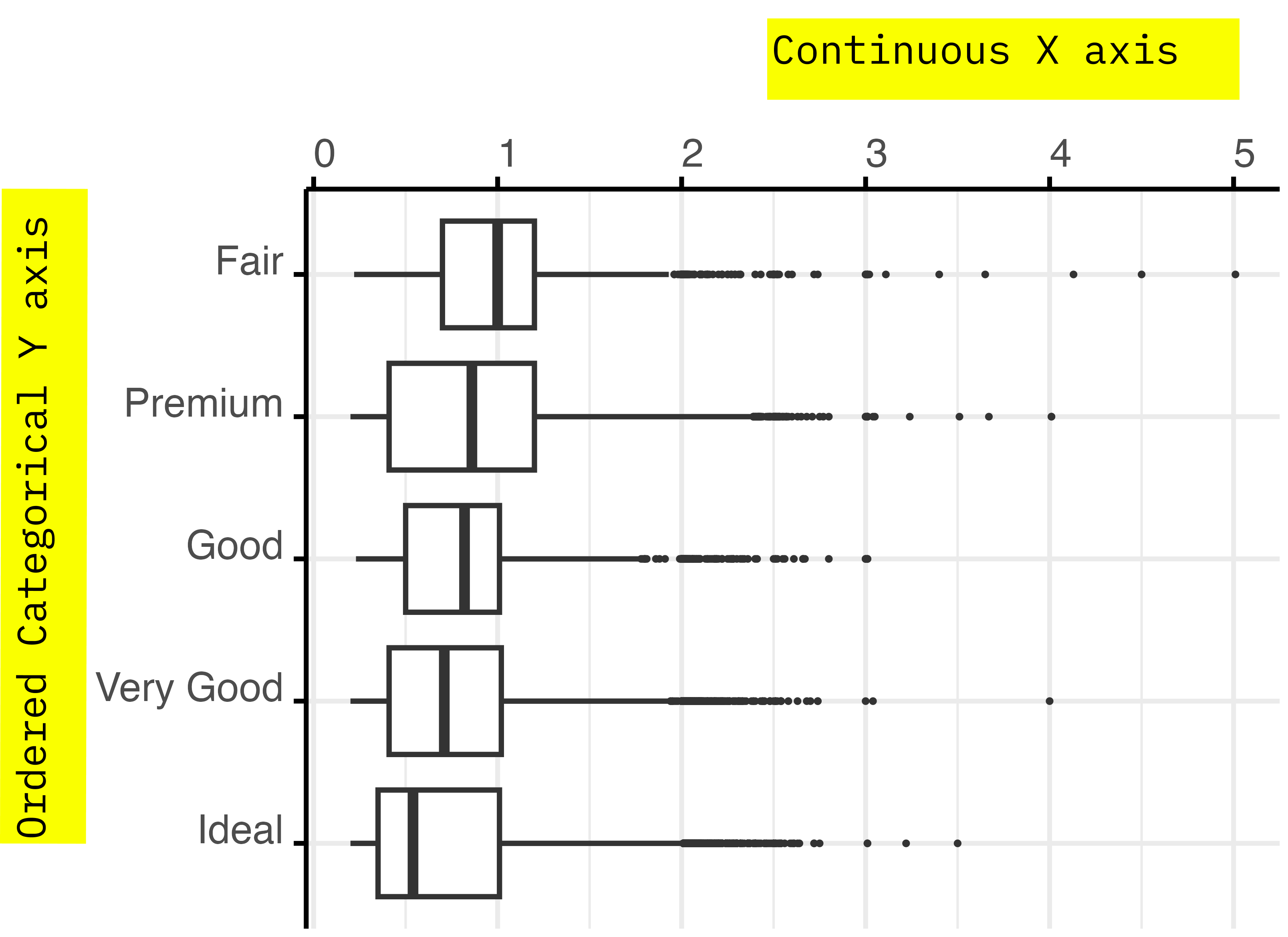
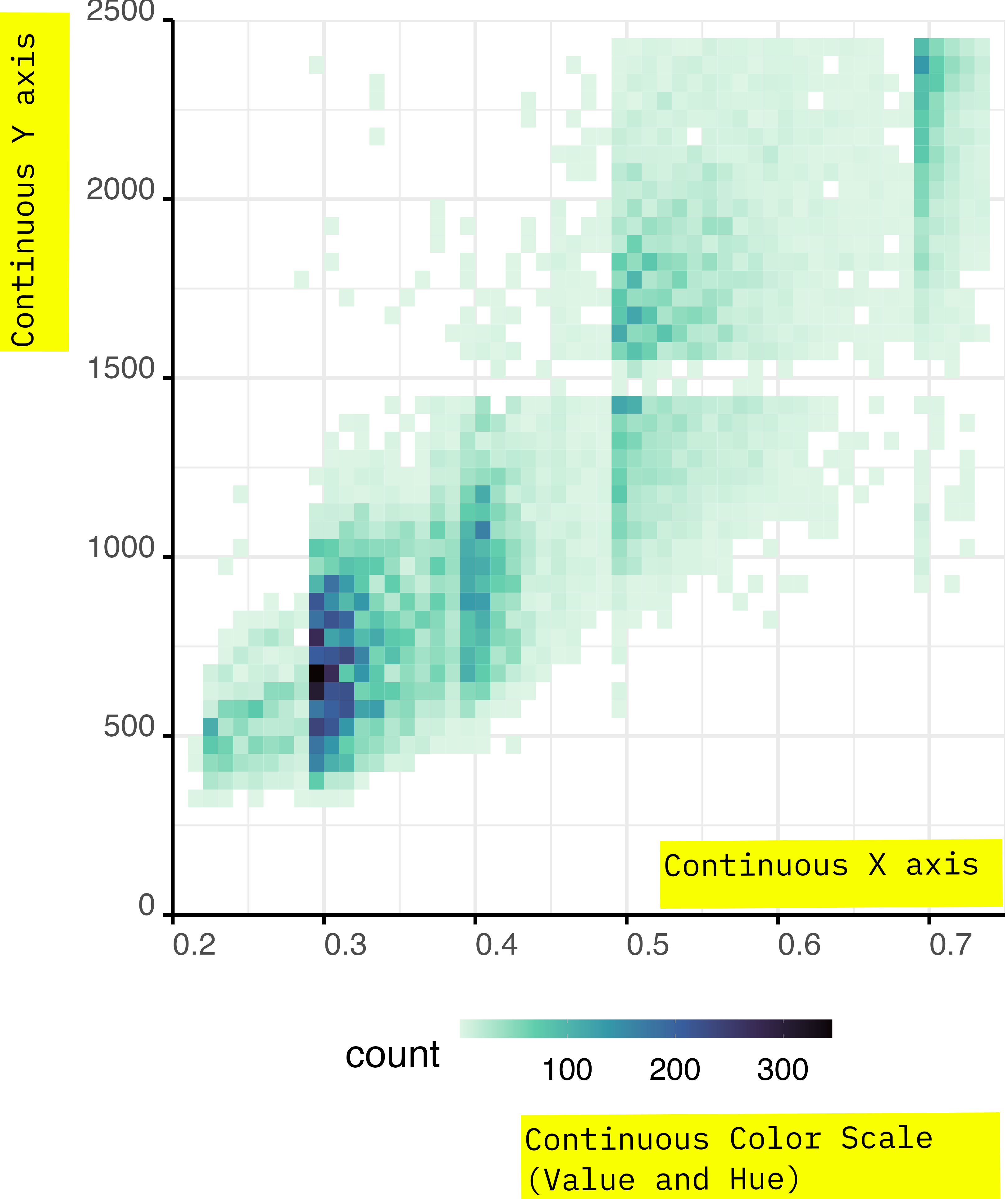
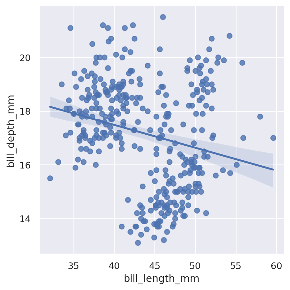
The x and y planar variables are largely perceived as a quantitative linear space. And they are great for representing quantitative and qualitative data.
The planar variables are the x and y coordinates on your planar screen, which readily translate to the x and y positions in your graph.
(f you use cartesian coordinates or to a transformed version of them if you use more elaborate coordinate systems)
Planar Variables
You can place qualitative variables both in the x and y variable. In this case the x might stop being the independent variable, and the y stops being the response.
Often there is no clear hypothetical relationship of cause effect between two variables, in that case you can invert the x and the y freely.
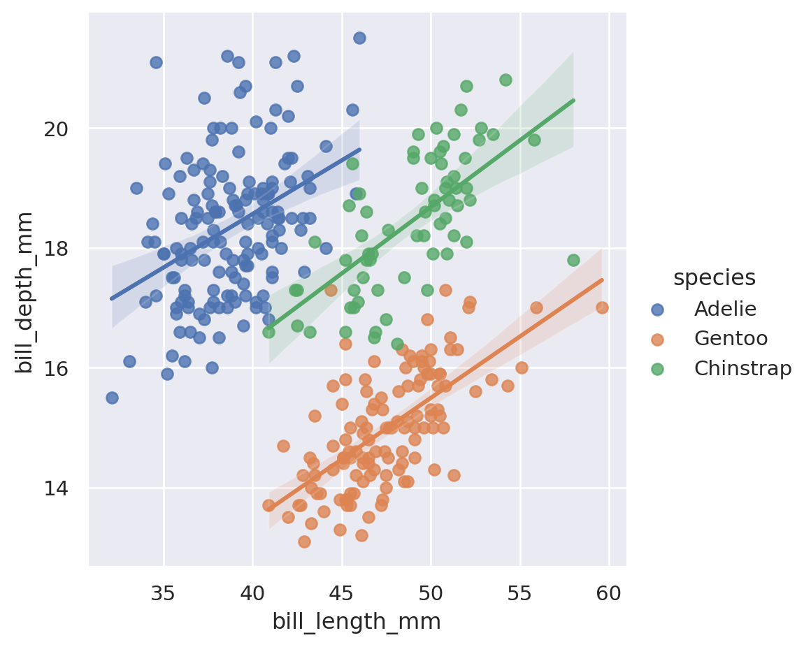
Colour
Colours can be mapped both to categorical and continuous variables.
With some caveats, colours are a multidimensional space:
- Not perceived in a fully linear way.
- Perceived in different ways by different people.
Color Spaces
If you find it hard to plan colours, don’t worry, colours are complex for everyone.
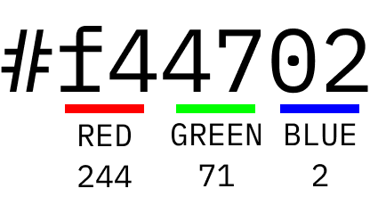
On a screen, colours are defined as three hexadecimal strings, that combine 256 levels of red, green and blue.
Color Spaces
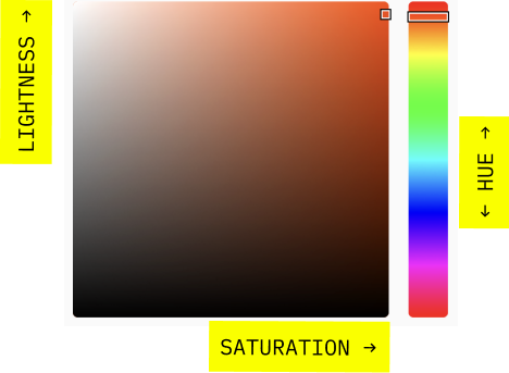
Colors are perceived non linearly, and the model of how colors are perceived by people gets constantly updated. The most used model is CIECAM02.
What should interest you is:
- HUE: what we call colour.
- LIGHTNESS: how close to black?
- SATURATION: how close to gray?
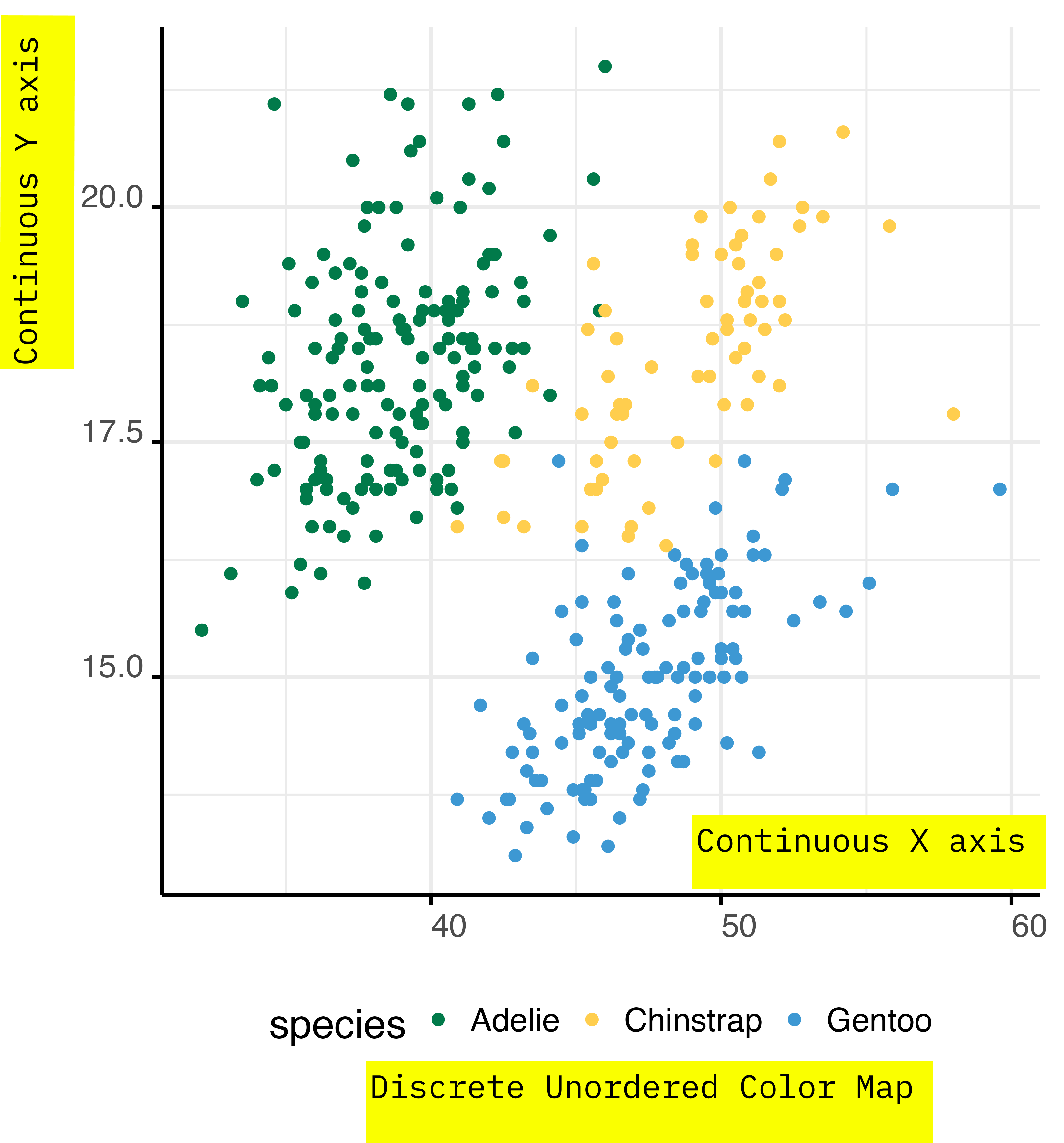
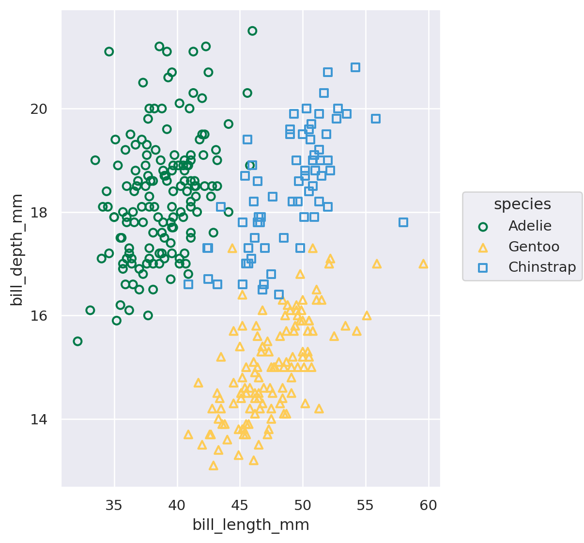
Categorical Variables
You can use colours to encode for categorical variables.
If the categorical variable is not ordered you should modulate the colors hue, with also small changes to saturation and lightness.
Always check if your colour palette is accessible by colour blind people.
Continous Variables
Using colours to encode continuous variables is somehow easier.
- Check that your colour palette is colour-blind friendly.
- Check that lightness and saturation change consistently with the data.
- You can modulate the hue resembling colours of natural phenomena; such as clouds, sunsets, rivers…
Colour Perception
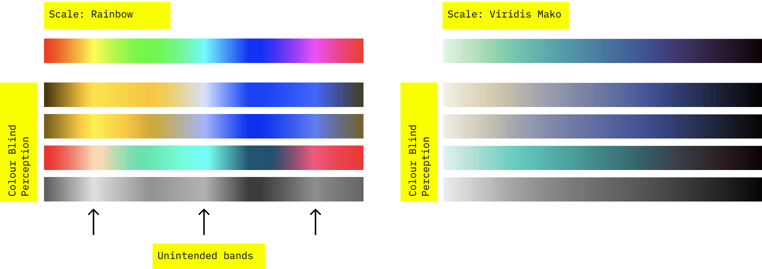
If you check that your palette are friendly to colour blind people, you can also detect unwanted patterns perception patterns.
You can use Firefox accessibility tools to simulate colour blind perception.
Good Colour Palettes


Categorical
In categorical palettes, you should be able to distinguish colours, even in small plotting characters.
Check if colours are different, even when plotted in black and white. Otherwise consider using and additional graphical variable to encode the information.
Quantitative
Continuous colour palette should be perceived linearly and univocally throughout the spectra. Check that this is true also for color blindness and black and white.
You should handle ordered categorical variables as if they were quantitative, not categorical.
Colours in Python
A presentation of the cubehelix color palette.
There are plenty of colour palette available in Python through Seaborn or other tools, so it’s unlikely that you’ll have to design your own.
It’s more likely that you’ll have to be able to choose a good one.
The Seaborn’s tutorial on how to choose a colour palette, is a great place to start.
Look also at Matplotlib’s palette guide, and at the blog post presenting the viridis and batlow perceptually uniform color maps.

Researcher Ed Hawkins was searching for an intuitive way to represent global warming.
He designed the concept of climate stripes, removing everything that’s not a direct mapping of data from an heatmap of average temperature.
On the x axis, each stripe is a year, from the year when the first data recording is available reliably.
The colour represents the relative change in temperature.
The y axis is not mapped to the data.
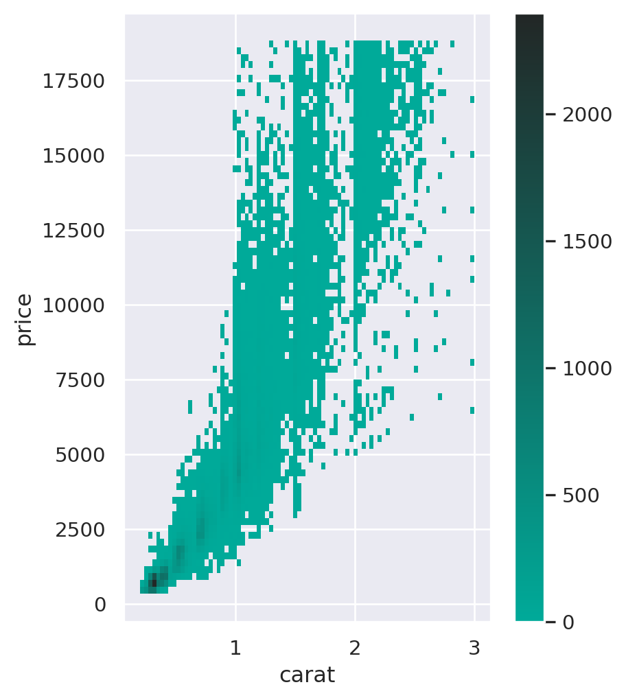
Colours - Continuous
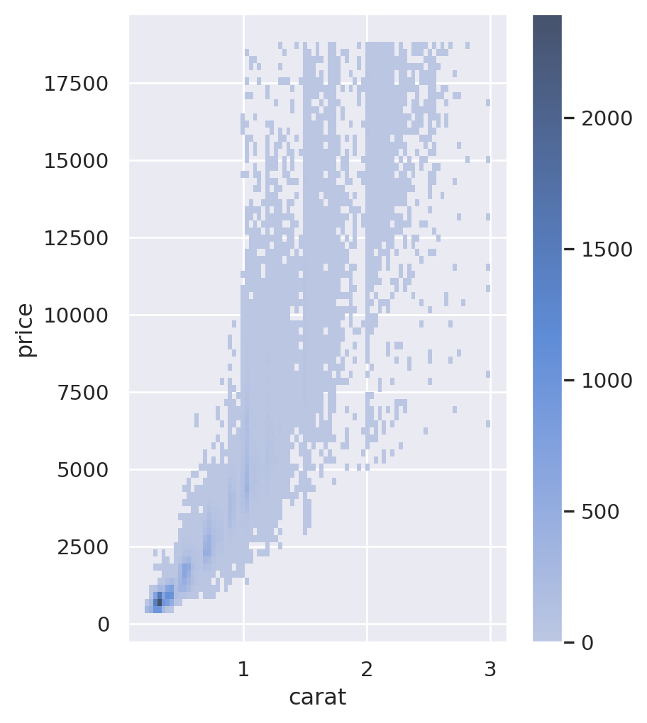
Colours - Continuous
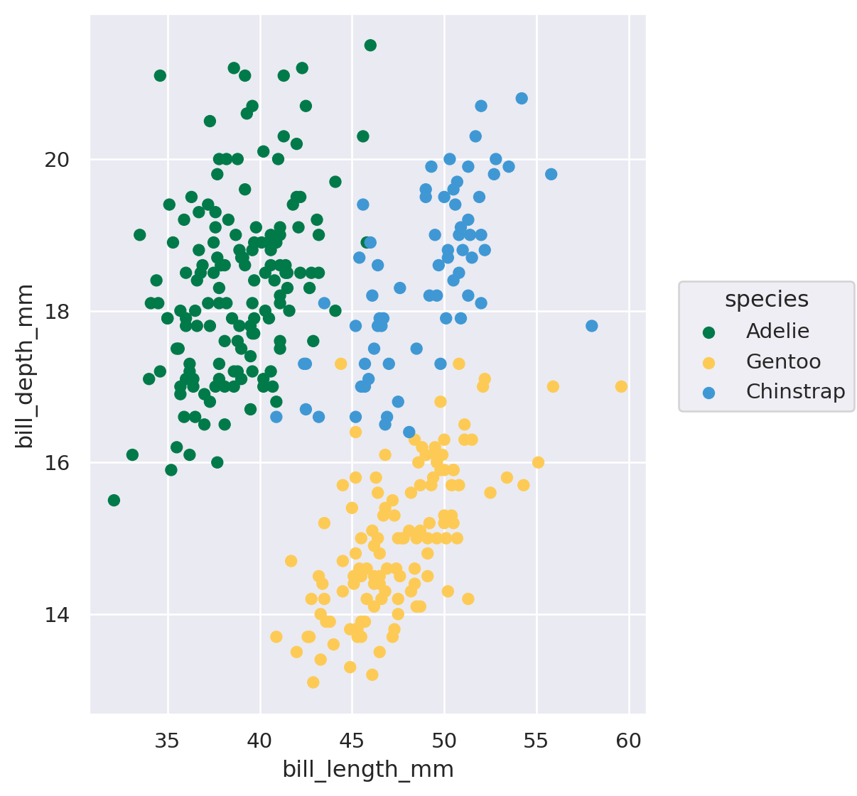
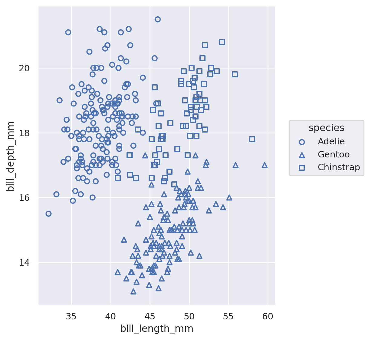
Colours - Categorical
Colours - Categorical
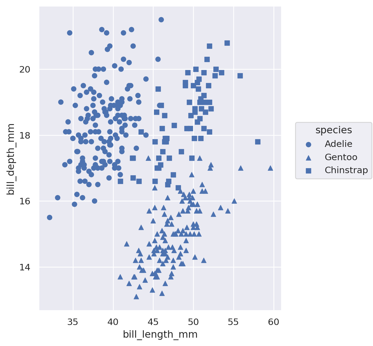
Shape
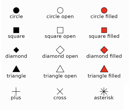
You can use marker shapes to encode categorical information.
Shapes are simple and easy to understand.
They can’t be used to represent quantitative data. They could be used for ordered categorical data, but I’d advise against this practice.
Shape
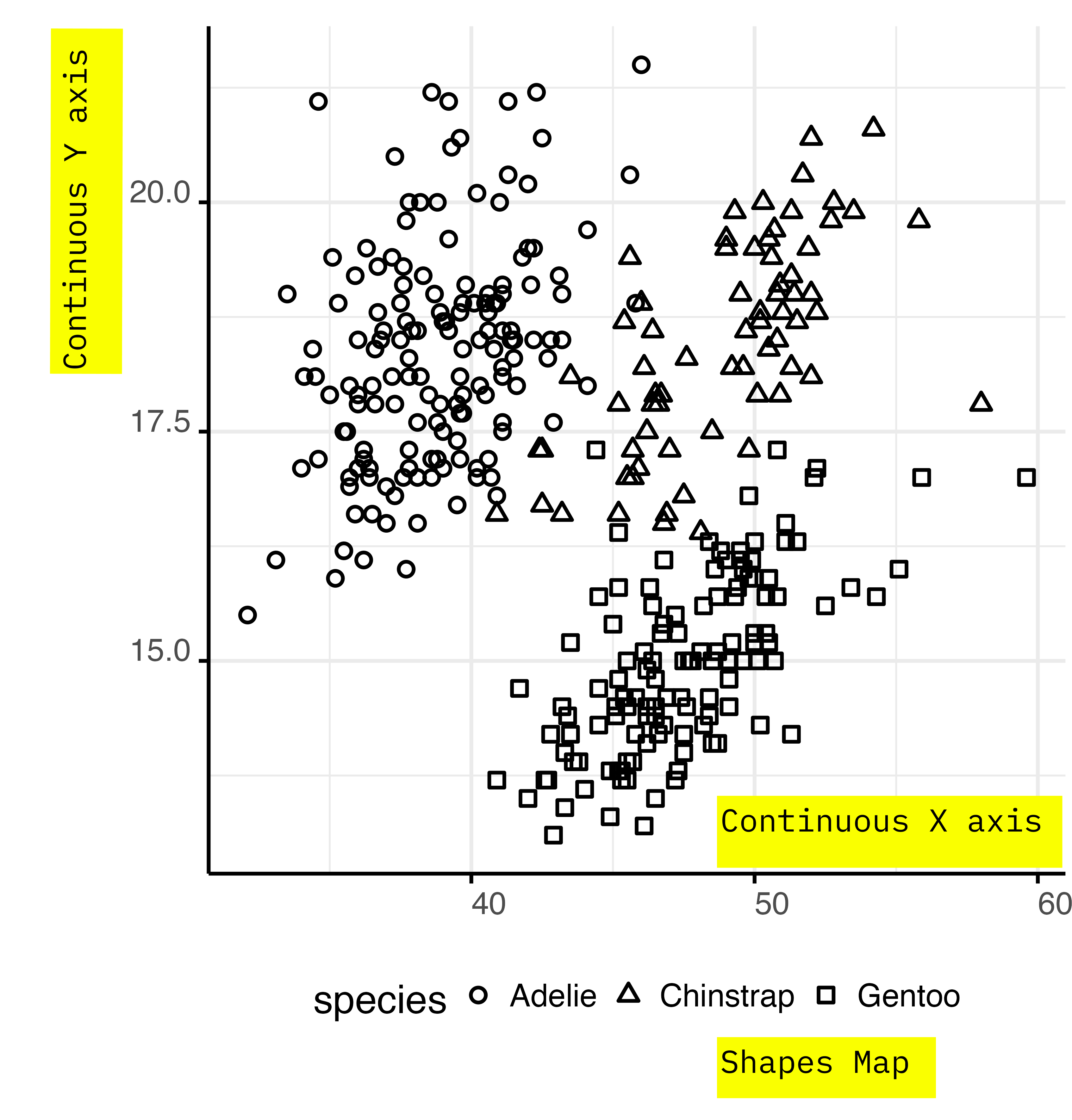
Shape
Shape
Shape
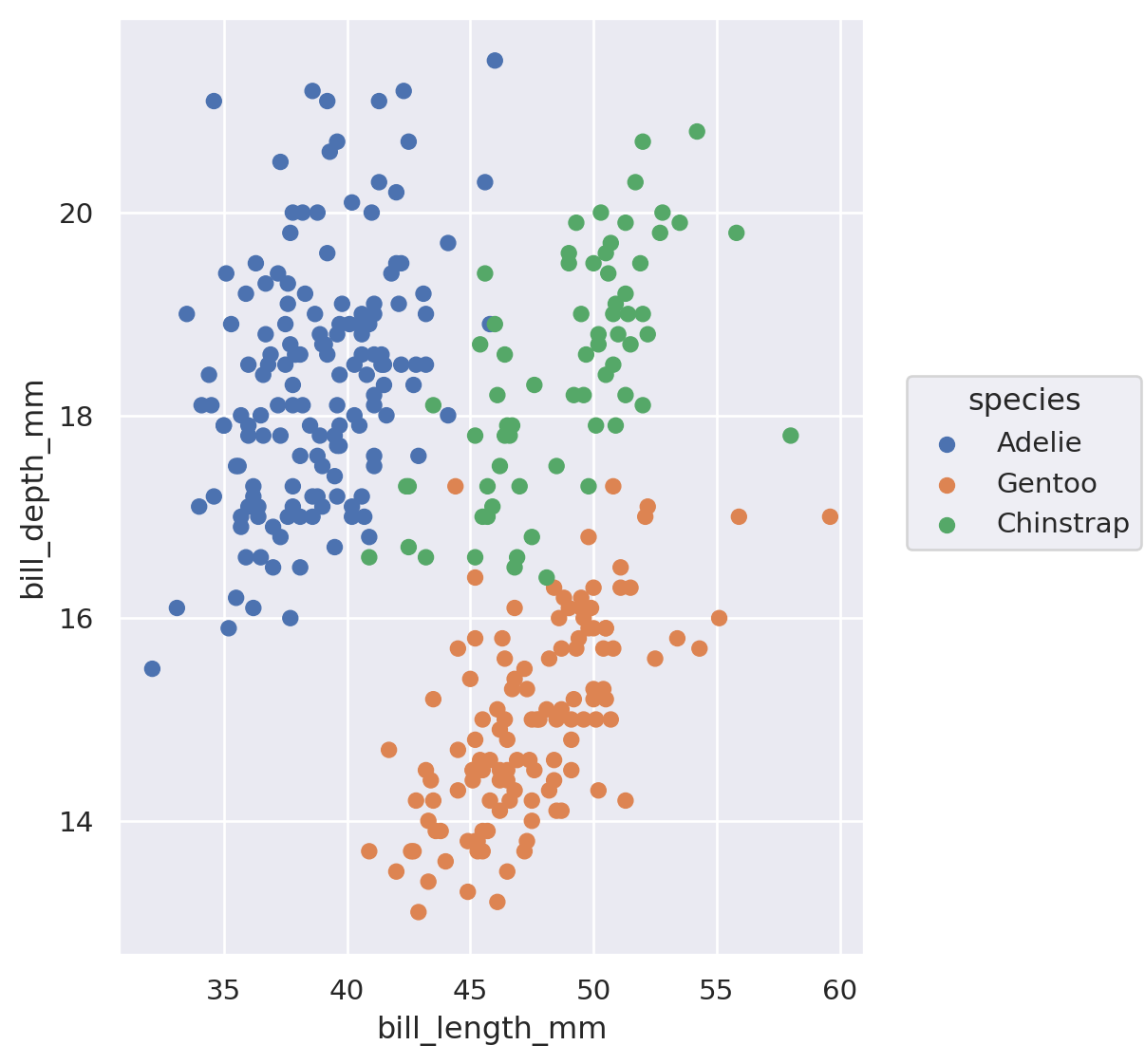
# double encode species
# with shape and colour
(
  so.Plot(
    data = penguins,
    x = 'bill_length_mm',
    y = 'bill_depth_mm',
    marker = 'species',
    color = 'species'
 )
 .add(
  so.Dot(
    stroke = 1.5,
    fill = False
    ),
 )
 .scale(
  marker = [
    'o',
    '^',
    's'
  ],
  color = [
  '#007a49',
  '#fdcb55',
  '#3f98d4'
 ]
 )
 .layout(size=(5, 6))
)
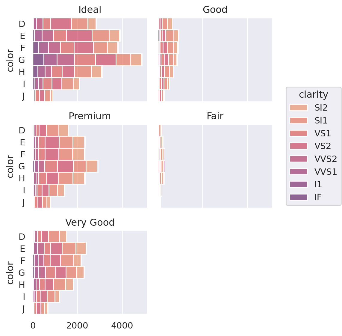
Size - Bar Chart
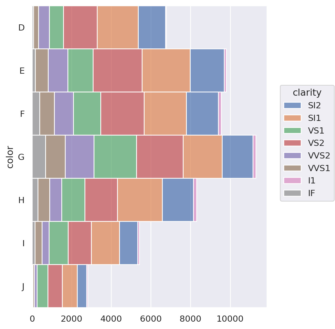
Size - Bar Chart
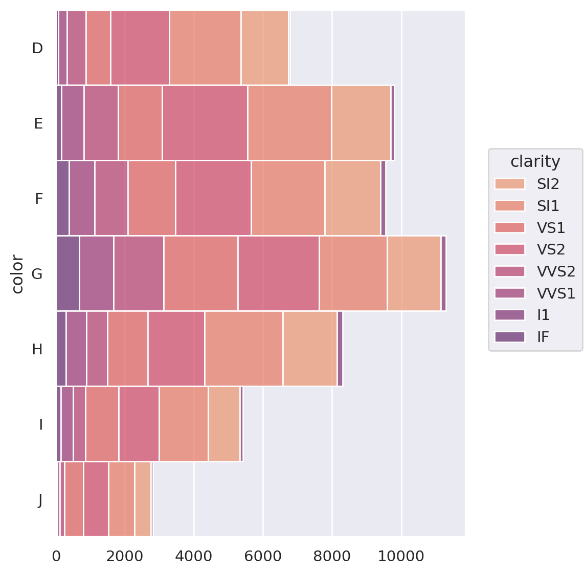
Size - Bar Chart
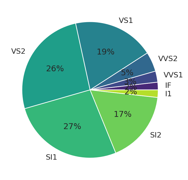
Area - Pie Chart
# count diamonds by clarity
counts = (diamonds
    .query('color == "J"')
    .groupby('clarity')
    .size())

# transform to percent
perc = (counts.values/
        counts.values.sum())
labels = counts.index

# define a color palette of the
# same length of the data
colors = sns.color_palette(
  'viridis',
  n_colors = perc.size
  )

# plot the py chart
plt.pie(
  perc,
  labels = labels,
  colors = colors,
  autopct='%.0f%%'
  );
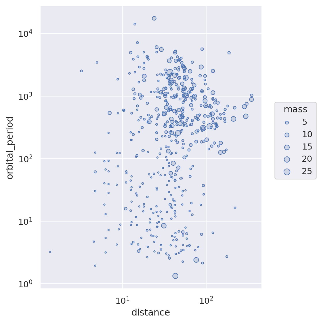
Area of Circles and Shapes

You can encode a continuous variable in the area of the circles in a scatterplot, or in the area the plotting character of your choice.
Our perception is not as good at comparing areas, so use this retinal variable with parsimony.
You can map data to the radius of circles or to the area directly. Mapping data to the radius might be perceptually better, although neither choice is optimal.
Radius of Circles
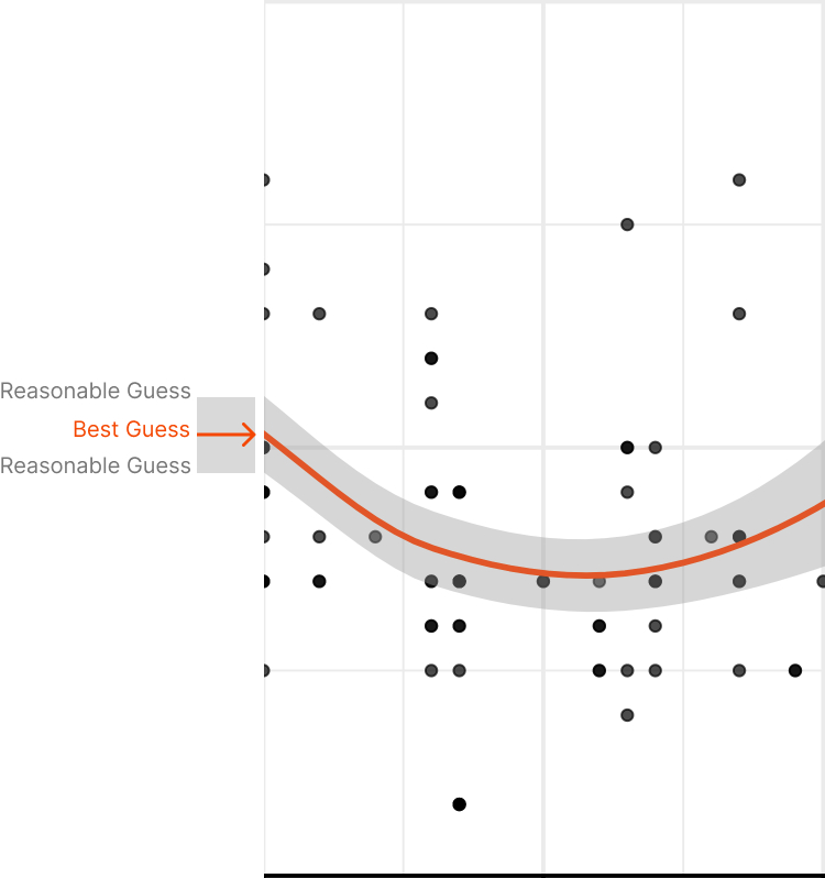
Area As Uncertainty
Area As Uncertainty
Area As Uncertainty
Area As Uncertainty
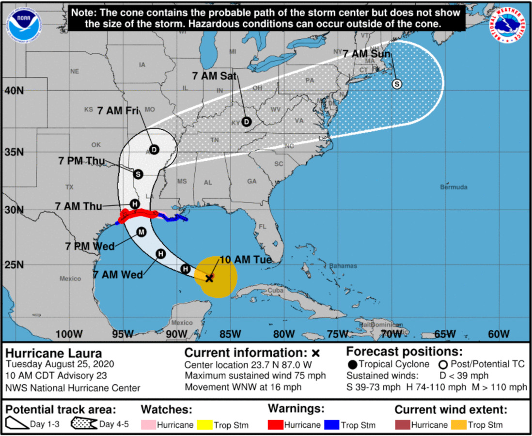
HURRICANE PROBABILITY CONE
Year: Current
Website: NOAA - Hurricane Center
The cone shows the forecasted path of the hurricane, from its current position. The size of the cone grows with the uncertainty in the path’s forecast
There’s evidence that we intuitively associate the size of the cone to the forecasted size of the hurricane, not to the uncertainty of its path.
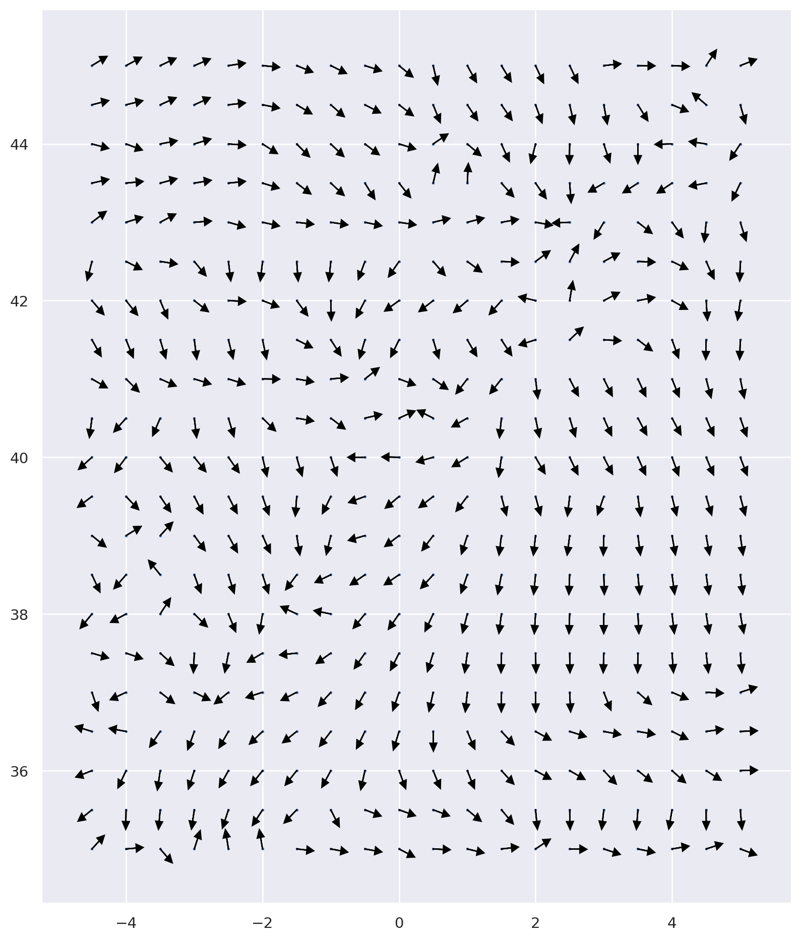
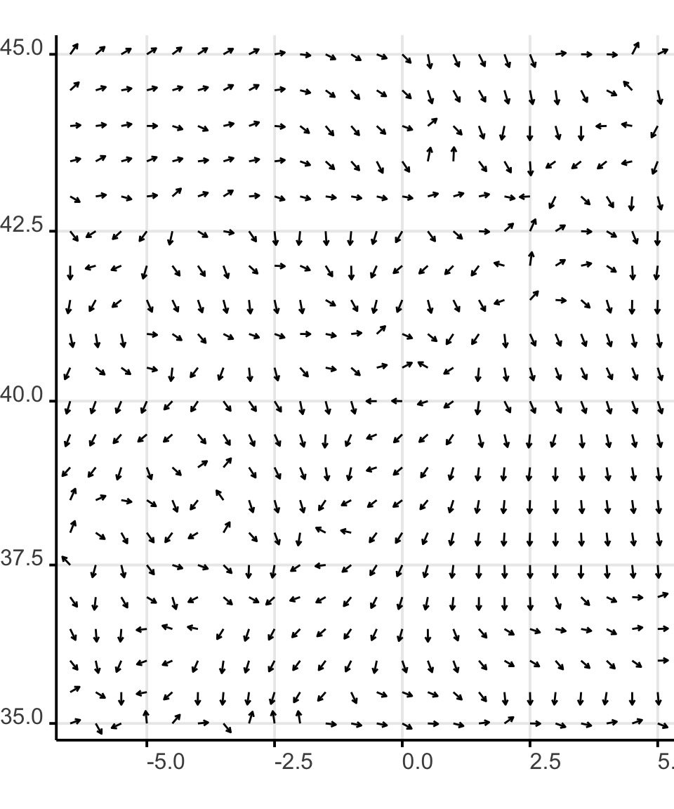
Orientation

The orientation of plotting characters is used to show the vectorial orientation of dimensions such as wind or other types of movements on a map.
The orientation of plotting characters is often used combined with their length, to show intensity and direction.
Orientation
In Seaborn or Pyplot there is no way to control the orientation of a plotting character directly. So you’ll have to use an arrow, calculating their start and end points from data.
Orientation
ax = plt.figure(
  figsize=(10,12)
  )

plt.scatter(
  wind.lon,
  wind.lat,
  s = 1
  )

arrow_scale = .15

for index, row in wind.iterrows():
    plt.arrow(
      x = row['lon'],
      y = row['lat'],
      dx = cos(
        row['dir']*pi/180
      )*arrow_scale,
      dy = sin(
        row['dir']*pi/180
      )*arrow_scale,
      color = '#000',
      head_width=0.1,
      head_length=0.1
      )
Orientation and Size
ax = plt.figure(
  figsize=(10,12)
  )

plt.scatter(
  wind.lon,
  wind.lat,
  s = 1
  )

arrow_scale = .05

for index, row in wind.iterrows():
    plt.arrow(
      x = row['lon'],
      y = row['lat'],
      dx = row['speed']*cos(
        row['dir']*pi/180
      )*arrow_scale,
      dy = row['speed']*sin(
        row['dir']*pi/180
      )*arrow_scale,
      color = '#000',
      head_width=0.1,
      head_length=0.1
      )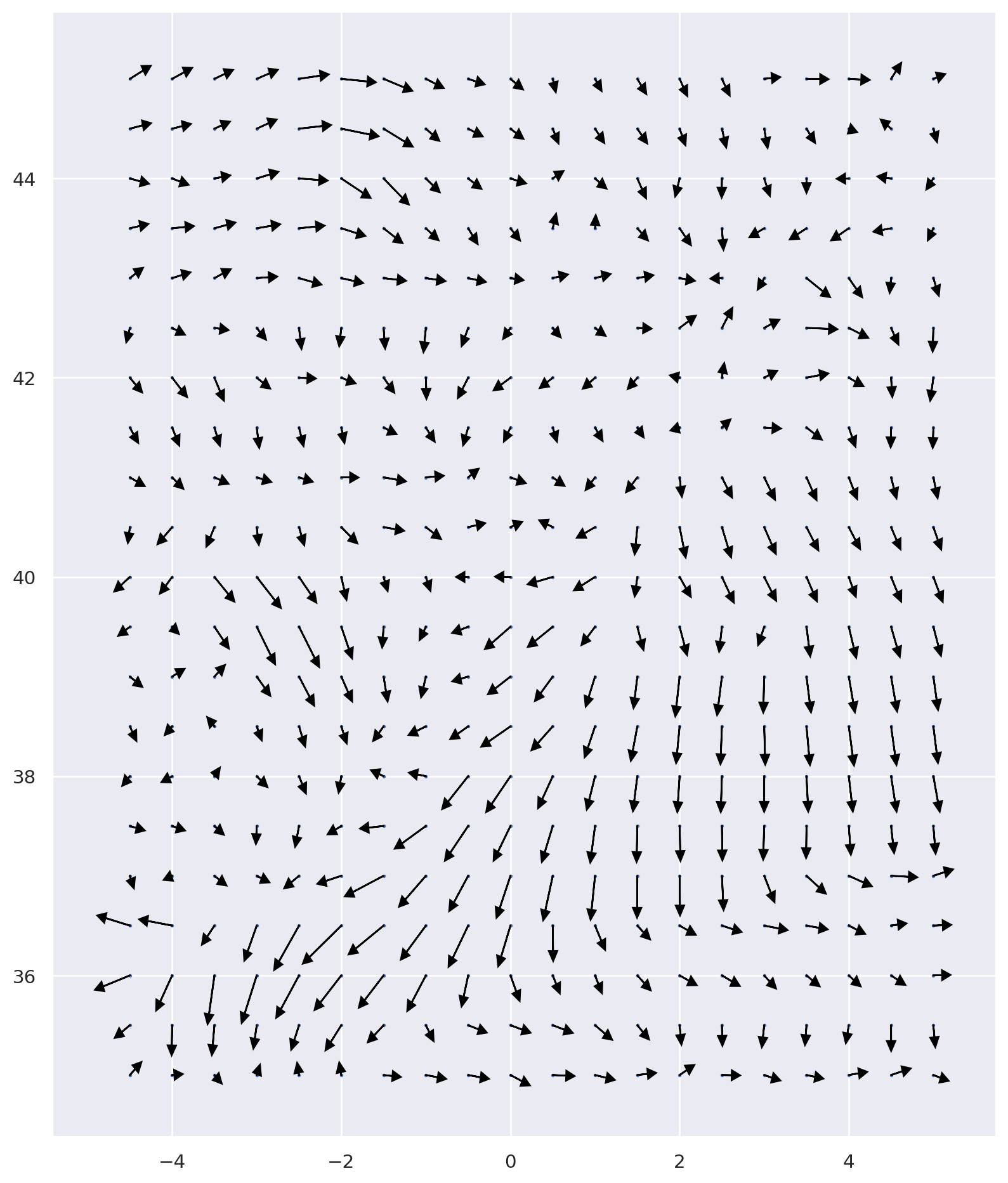
Orientation and Size

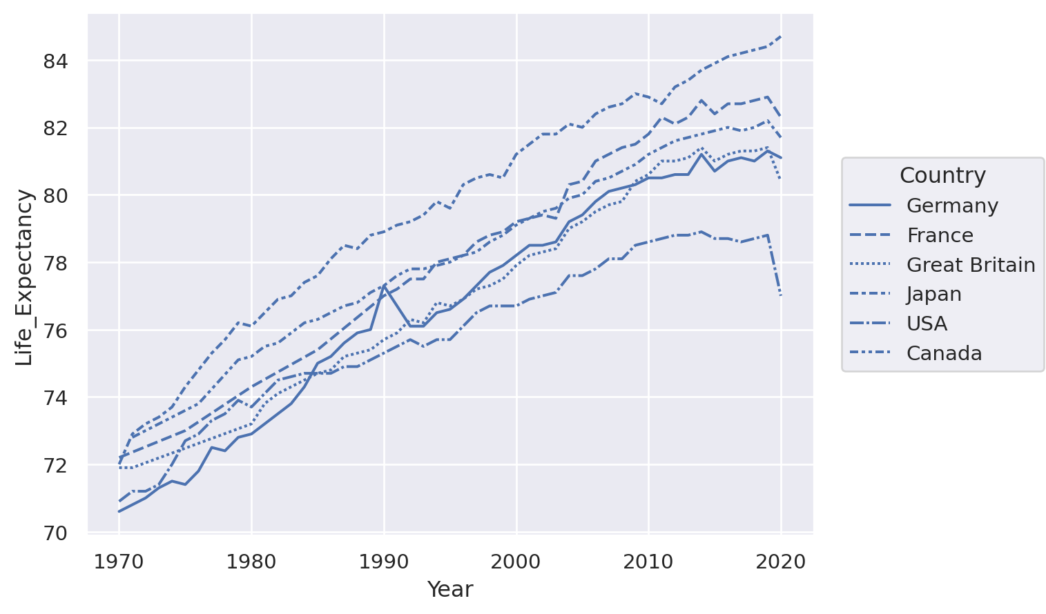
Texture
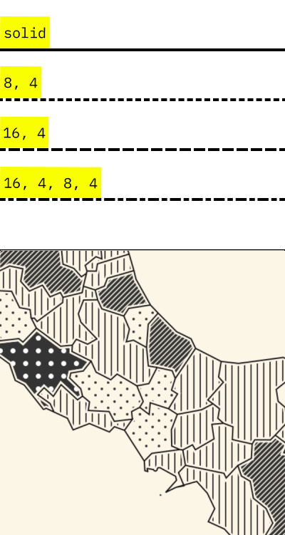
The texture is often used to distinguish various types of lines.
It can also be used to fill shapes in a semi-quantitative way. This aspect fell in disuse, but it can be a good choice for printer-friendly visualization.
Unfortunately python does not have good support for texture filling areas; the example on the side is from texture.js.
_-_Climate_Lab_Book_(Ed_Hawkins).png)