>A Grammar for Graphics > A collection of terms and concepts to declare data visualization systematically
\ Otho Mantegazza _ Dataviz for Scientists _ Part 2.2
Can you Describe a Graph?
If we find a way to describe graphs systematically, then we can design and develop them more easily.
Most technical graphs can be declared with a system of rules called “Grammar of Graphics”.
This system of rules is the basis for many data visualization packages, such as ggplot2 , Seaborn and Altair .
A Grammar for Graphics
The “Grammar of Graphics” was developed by Leeland Wilkinson .
It was later extended by Hadley Wickham, who started encoding it in the R package ggplot2 .
Recently, a new API in the style of ggplot2 was included in a new version of Seaborn , for Python,
A Grammar for Graphics
The layered grammar of graphics defines graphics as composed of:
A default dataset and set of mappings from variables to aesthetics.
One or more layers, with each layer having one geometric object, one statistical transformation, one position adjustment, and optionally, one dataset and set of aesthetic mappings.
One scale for each aesthetic mapping used.
A coordinate system.
The facet specification.
Aesthetics
The word aesthetic is derived from the Ancient Greek αἰσθητικός (aisthētikós, “perceptive, sensitive, pertaining to sensory perception”), which in turn comes from αἰσθάνομαι (aisthánomai, “I perceive, sense, learn”) and is related to αἴσθησις (aísthēsis, “perception, sensation”). [Wikipedia]
Let’s Describe Graphs
Let’s describe three historical graphs in terms of the Grammar of Graphics.
How are data mapped to aesthetics?
What statistical transformation is applied?
Which geometric object is used?
What is the coordinate system?
Are the data split in facets?
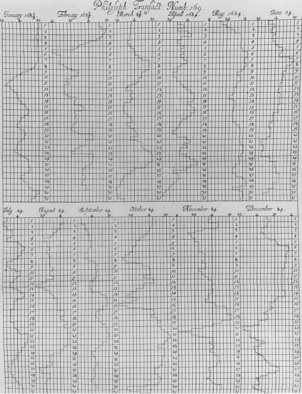
Describe the weather history by Robert Plot.
Aesthetics Mapping:
x: atmospheric pressure
y: day of the month
Statistical Transformation:
Geometric Object:
Coordinate System:
Facets:
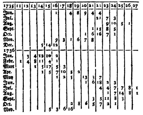
Describe this semigraph by Lambert.
Aesthetics Mapping:
Statistical Transformation:
Geometric Object:
Coordinate System:
Facets:
Describe the radial histogram by Nightingale
[previous page]
Aesthetics Mapping:
Statistical Transformation:
Geometric Object:
Coordinate System:
Facets:
Let’s Describe Graphs
Just one more.
Let’s challenge ourselves a bit more.
Now describe the web based data visualization on the next page. Is a weather map taken from the beautiful app Windy .
Can you do it with the Grammar of Graphics as before? How many layers of information can you notice?
Describe the weather map by the app Windy .
[previous page]
Aesthetics Mapping:
Statistical Transformation:
Geometric Object:
Coordinate System:
Facets:
For the main data visualization, how many layers of information do you notice?
Seaborn’s Interface
Seaborn is one of the main tools for declaring graphics in Python, together with Pyplot and Altair .
Seaborn’s object interface is under active development and is based on the layered grammar of graphics.
It can be used both for explorative analysis and for publication ready graphs.
Packages
# Seaborn Object Interface import seaborn.objects as so# The Palmer penguins dataset; # that we are going to use for practice from palmerpenguins import load_penguins= load_penguins()
A default dataset…
= penguins= (5 , 6 ))
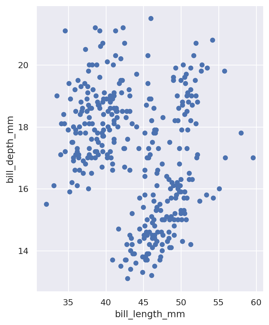
A set of mappings from variables to aesthetics…
= penguins,= 'bill_length_mm' ,= 'bill_depth_mm' = (5 , 6 ))
One or more layers, with geometric object, related to the aesthetic mappings.
= penguins,= 'bill_length_mm' ,= 'bill_depth_mm' = (5 , 6 ))
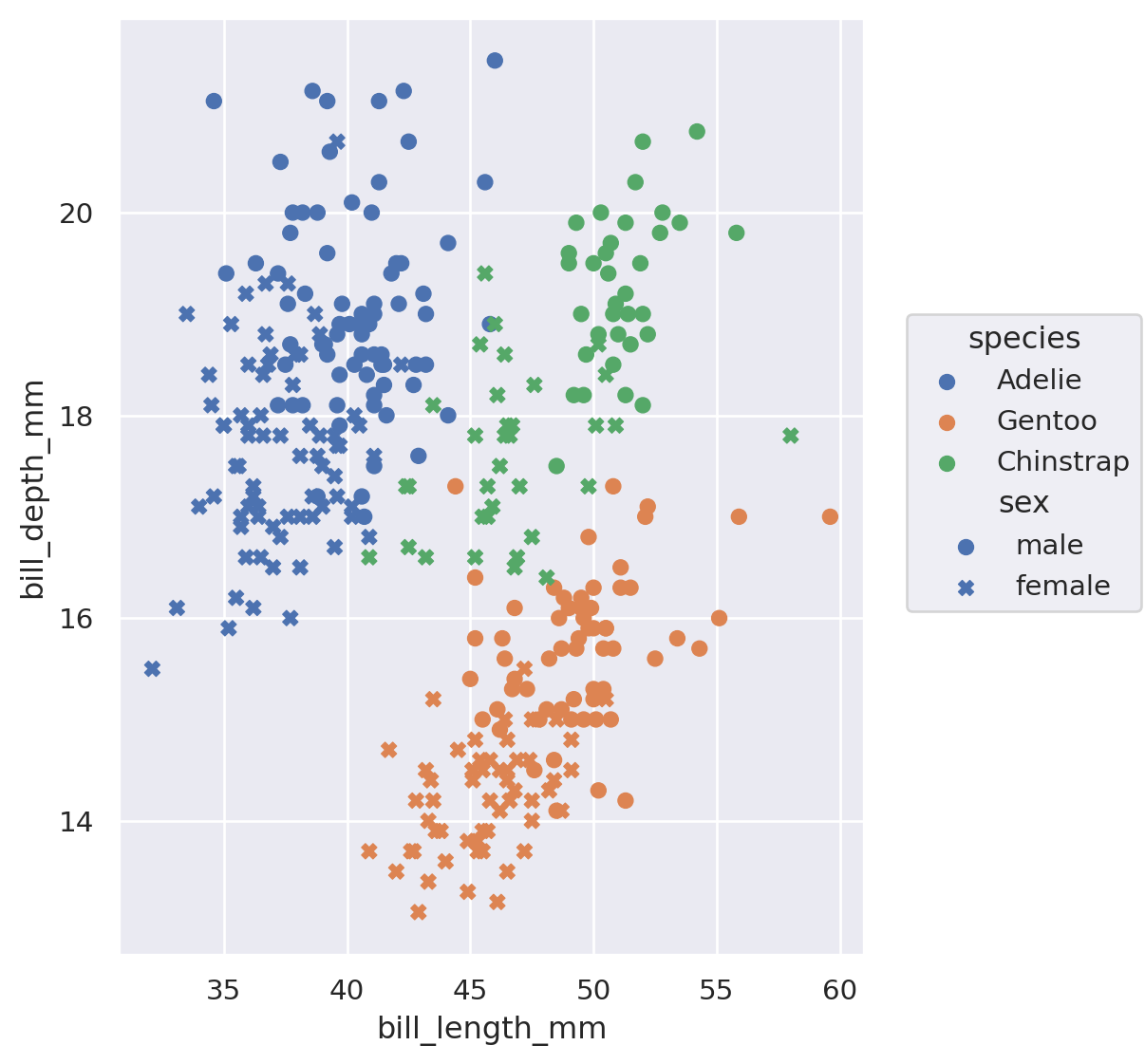
More variables mapped to aesthetics and represented by the geometric object.
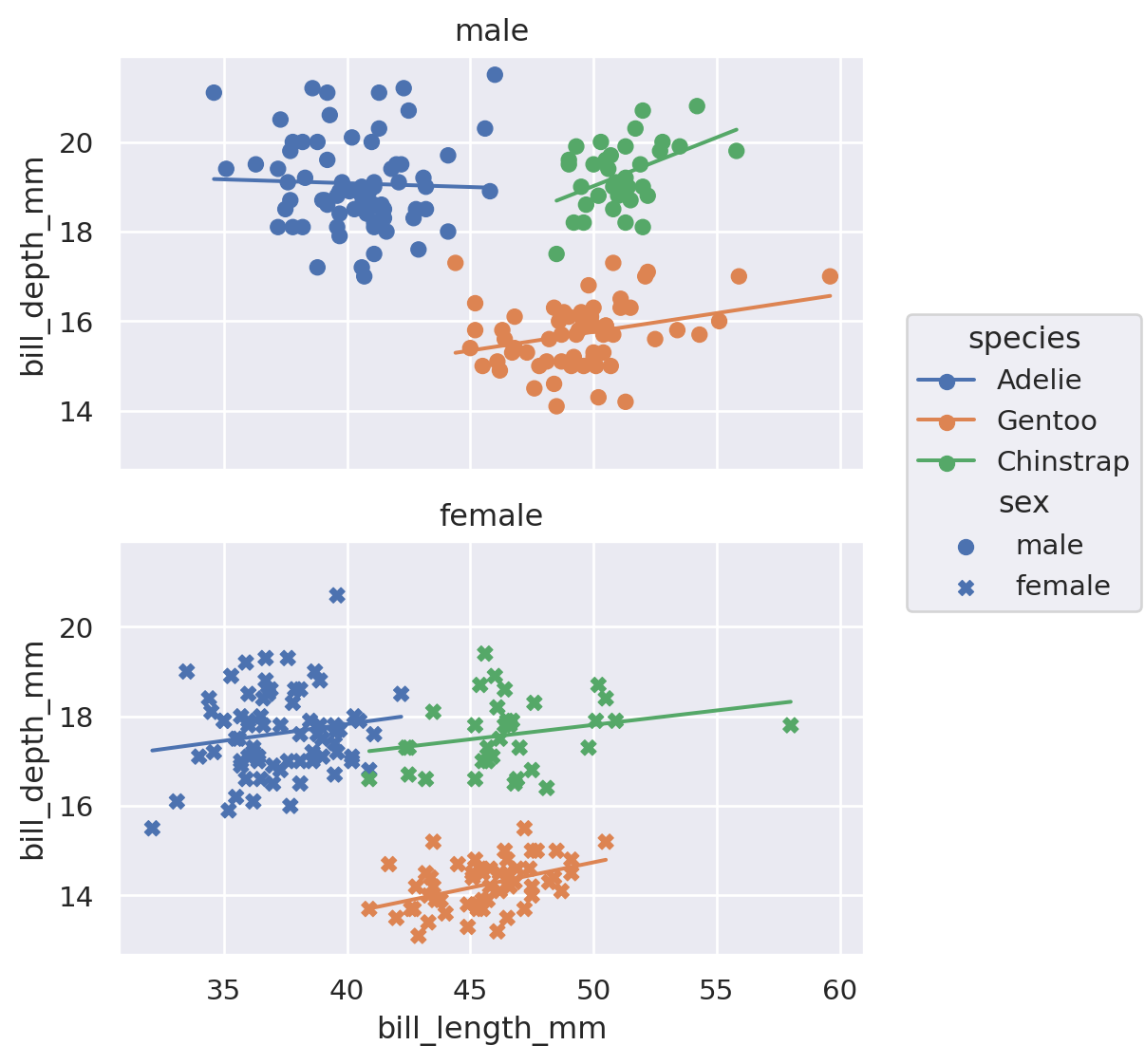
= penguins,= 'bill_length_mm' ,= 'bill_depth_mm' ,= 'species' ,= 'sex' = (5 , 6 ))
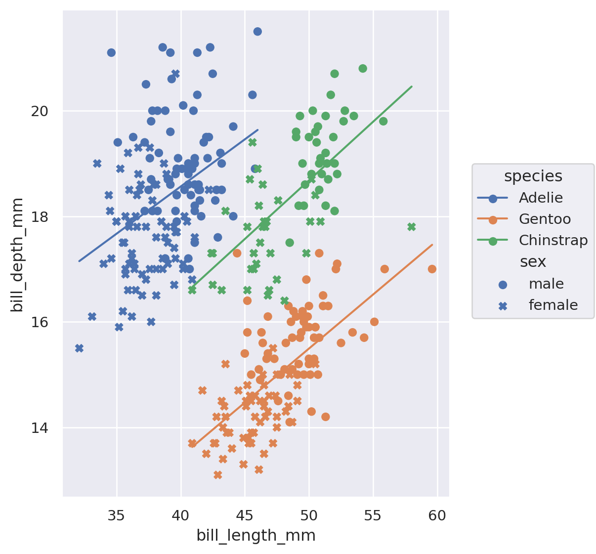
A layer with a different geometric object and a statistical transformation.
= penguins,= 'bill_length_mm' ,= 'bill_depth_mm' ,= 'species' = 'sex' = 1 )= (5 , 6 ))
Aesthetics can be mapped to all or to just one layer.
= penguins,= 'bill_length_mm' ,= 'bill_depth_mm' ,= 'species' = 'sex' = 1 )= (5 , 6 ))
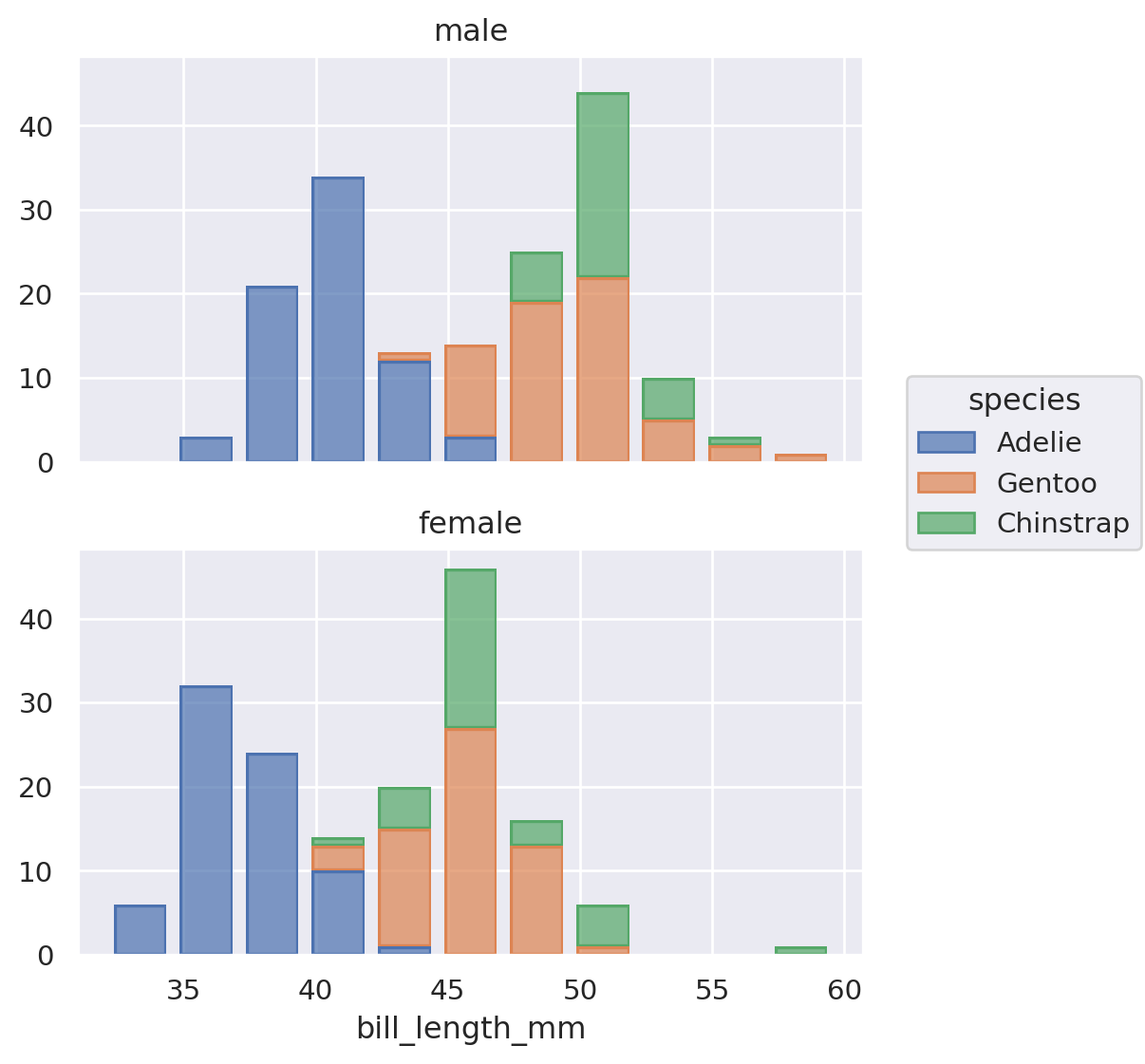
A facet specification.
= penguins,= 'bill_length_mm' ,= 'bill_depth_mm' ,= 'species' = 'sex' = 1 )= 'sex' = (5 , 6 ))
A default dataset…
= penguins= (5 , 6 ))
A set of mappings from variables to aesthetics…
= penguins,= 'bill_length_mm' = (5 , 6 ))
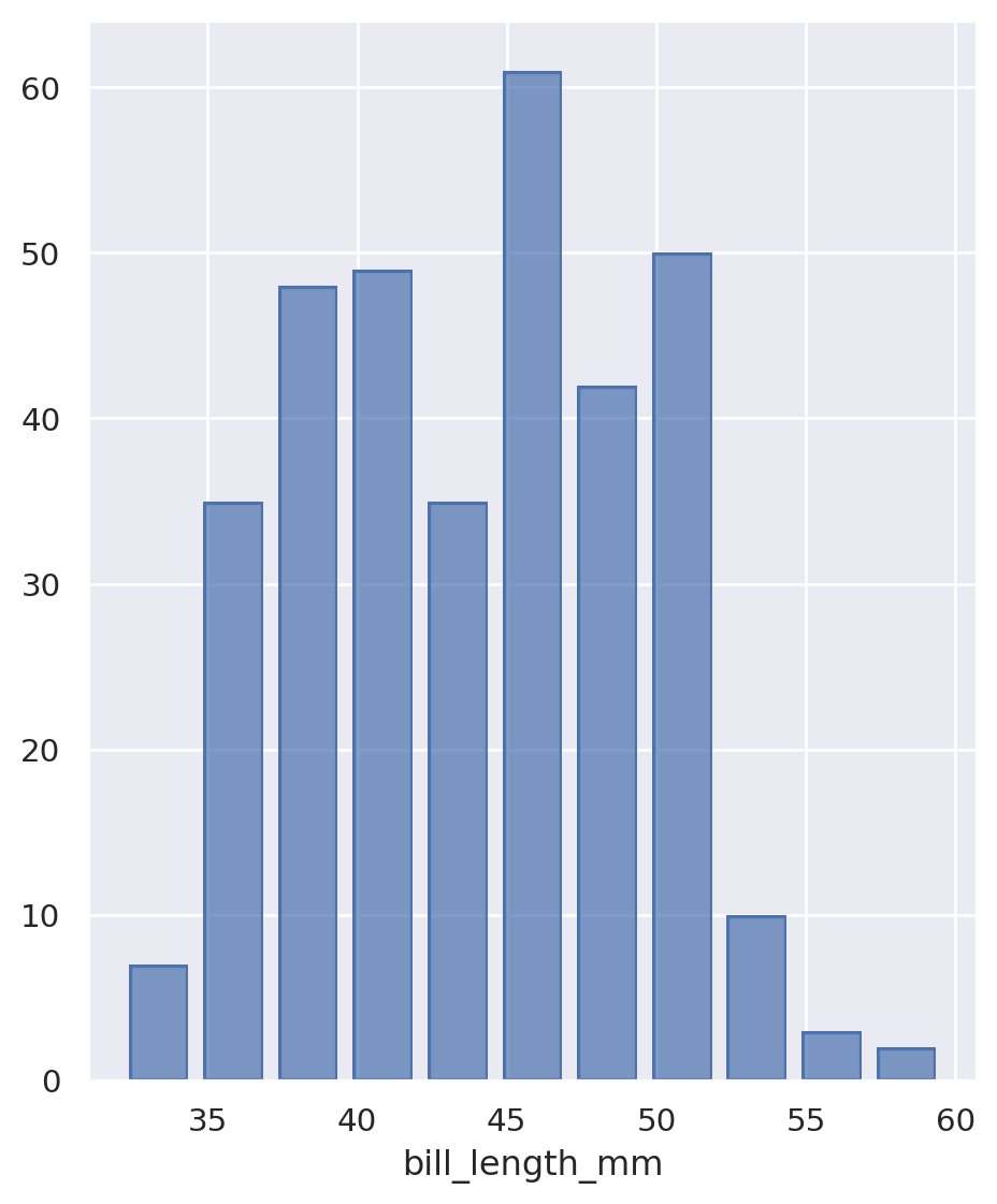
A layer including geometric objects and a statistical transformation.
= penguins,= 'bill_length_mm' = (5 , 6 ))
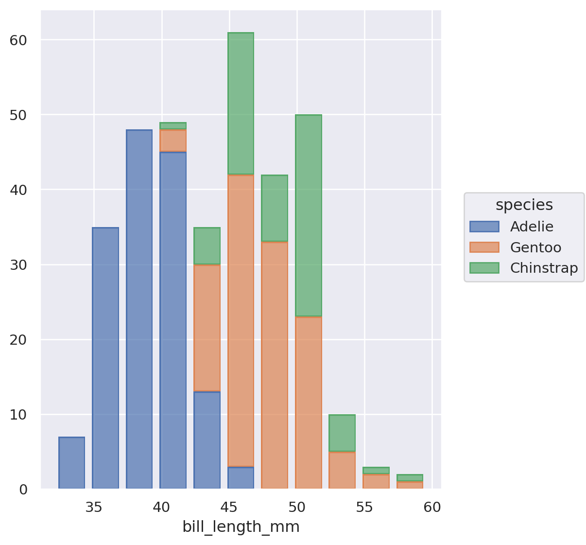
More aesthetic mappings, and a position adjustment.
= penguins,= 'bill_length_mm' ,= 'species' = (5 , 6 ))
The facet specification.
= penguins,= 'bill_length_mm' ,= 'species' = 'sex' = (5 , 6 ))
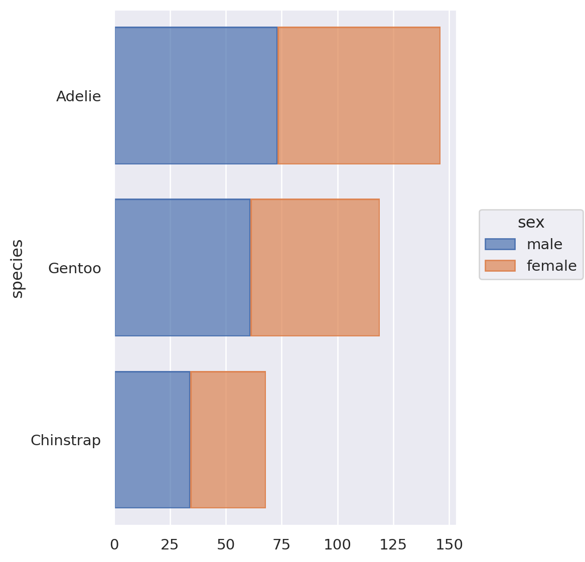
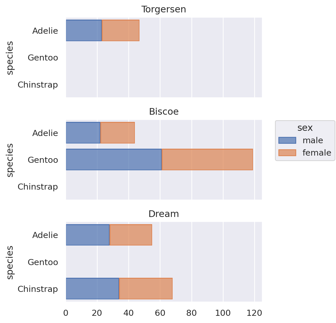
A Horizontal Stacked Bar Chart
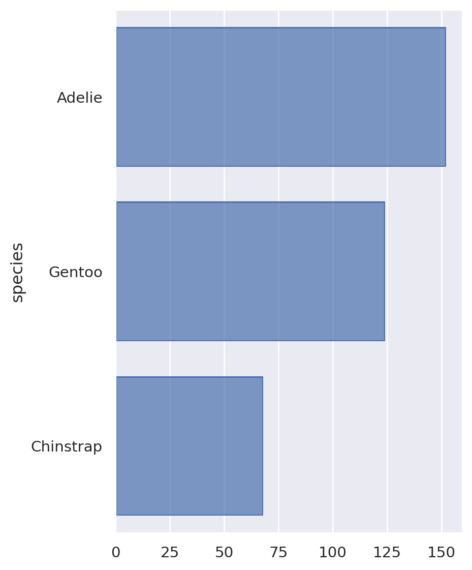
A default dataset…
= penguins= (5 , 6 ))
A set of mappings from variables to aesthetics…
= penguins,= 'species' = (5 , 6 ))
A layer including geometric objects and a statistical transformation.
= penguins,= 'species' = (5 , 6 ))
More aesthetic mappings, and a position adjustment.
= penguins,= 'species' ,= 'sex' = (5 , 6 ))
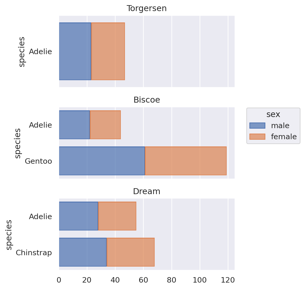
A facet specification.
= penguins,= 'species' ,= 'sex' = 'island' = (5 , 6 ))
Remove empty bars.
= penguins,= 'species' ,= 'sex' = 'island' = False )= (5 , 6 ))
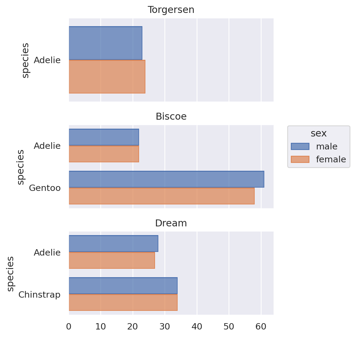
Change the position adjustment.
= penguins,= 'species' ,= 'sex' = 'island' = False )= (5 , 6 ))


.jpg)